Customising
Whiteprint is designed to be customised. There’s a lot to talk about here, so let’s dive in.
First, make sure you have followed the Production setup guide. Next, run the watch command:
npx gulp whiteprint:watchYour files are now being watched, and will be rebuilt when you makes changes.
Whiteprint is customised by configuring variables. These variables are set in different places, depending on how targeted you want the change to be. To explore the options, let’s make a page with a few components on it.
<!doctype html>
<html lang="en">
  <head>
    <meta charset="utf-8">
    <meta name="viewport" content="width=device-width, initial-scale=1, shrink-to-fit=no">
    <link rel="stylesheet" href="css/styles.css" />
  </head>
  <body>
    <div class="cover">
      <div class="cover_content">
        <div class="stack">
          <div class="card">
            <div class="card_section">
              <h1 class="text-8">Card one</h1>
            </div>
            <div class="card_section">
              <div class="group">
                <button class="button-primary">Button one</button>
                <button class="button">Button two</button>
              </div>
            </div>
          </div>
          <div class="columns">
            <div>
              <div class="card">
                <div class="card_section">
                  <h2 class="text-8">Card two</h1>
                </div>
                <div class="card_section">
                  <button class="button">Button three</button>
                </div>
              </div>
              <div class="card">
                <div class="card_section">
                  <h2 class="text-8">Card three</h1>
                </div>
                <div class="card_section">
                  <button class="button">Button four</button>
                </div>
              </div>
              <div class="card">
                <div class="card_section">
                  <h2 class="text-8">Card four</h1>
                </div>
                <div class="card_section">
                  <button class="button">Button five</button>
                </div>
              </div>
            </div>
          </div>
        </div>
      </div>
    </div>
  </body>
</html>
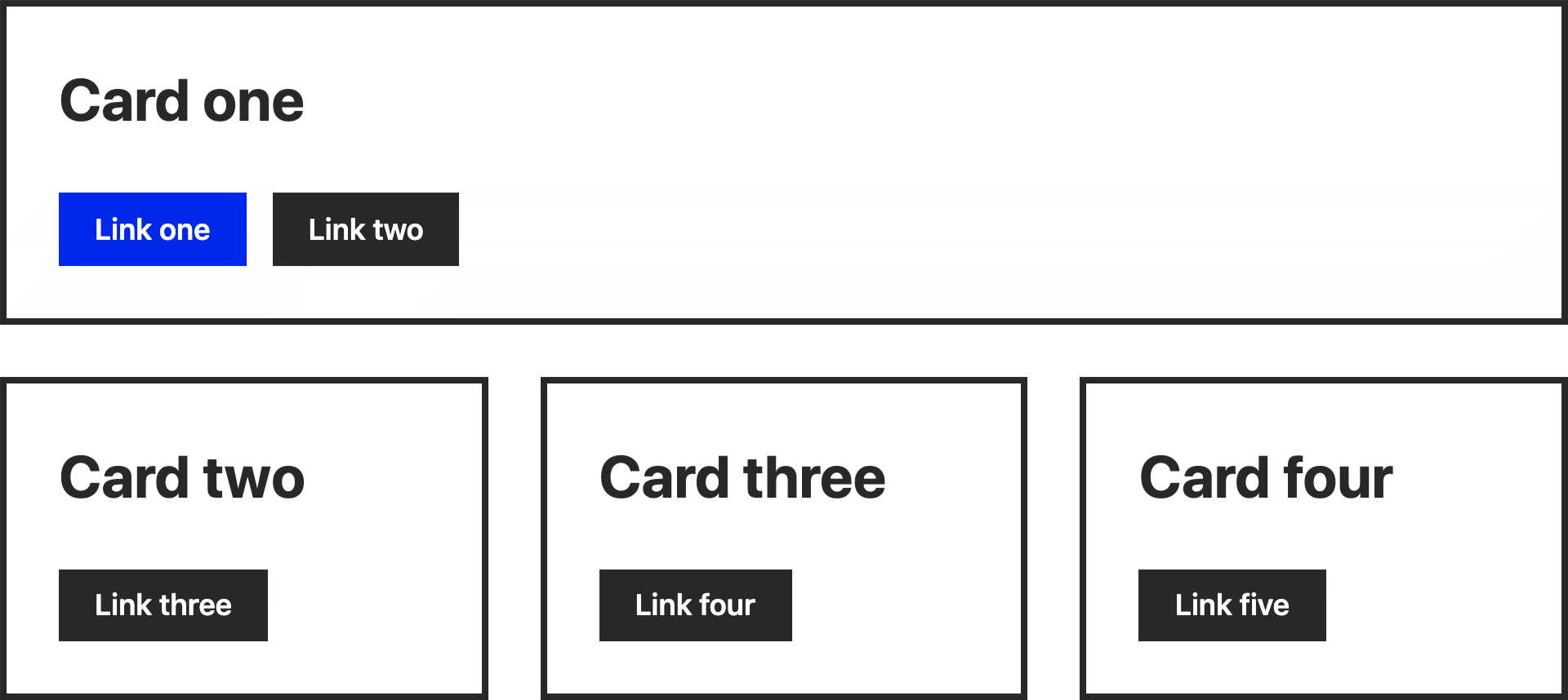
Load that page in your browser and you should see something like this:

Let’s say the first thing you want to do is give everything - all the cards and all the buttons - rounded corners. The best way of doing that would be at the component level. To do this, edit the --component-border-radius property in src/css/variables.css. Change it from 0 to 6px, for example.
Not content with your rounded corners, you want to add some drop-shadows. Rather than applying the shadows to everything, you just want them on the cards. In this case, rather than changing the component level variable, change the card specific one --card-shadow. Give it a box-shadow value, such as 10px 10px 0 0 rgba(0,0,0,0.8).
The final level of specificity is changing instances of a component. For example, “Button five” does something irreversible, so you have decided to make it red. This is where Whiteprint differs from other frameworks, that might give you a set of modifiers to achieve this. The Whiteprint way is to “fork” the component, that is to say duplicate then edit. “Button one” is an example of this in action. Look in your src/css/components directory and you’ll see button.css and button-primary.css. The later is a copy of the former, with a few variables changed. To create your red button, you would:
- Duplicate
button.css(name it something likebutton-danger.css - Edit the background colour (first) property. Eg.
#EE0000 - Edit the selector names as required. Eg.
.button-dangerand.button-danger_icon. - In the HTML, replace the class on “Button five” with your new one.
Having control of the selectors in this way not only allows you to create the variations required for your design, but to have control over your markup. By default, selectors are constructed using the C3 syntax, but if you prefer your own naming convention, or you want to be less abstract, you can replace those defaults.